Secrets of color coordination in your home decor.
Color coordination in home decor is an essential element in highlighting the aesthetics of spaces and achieving harmony between different elements.
It contributes to creating a comfortable and harmonious atmosphere inside the home, which directly affects the mood and feelings of the residents.
Ways to use color scheme in interior design
Contrasting colors | Synchronous colors When the colors are not consistent
or complementary together, this creates a balance between sophistication and modernity in the design. While the contrasting colors combine two opposites, adding boldness and vitality to the decor.
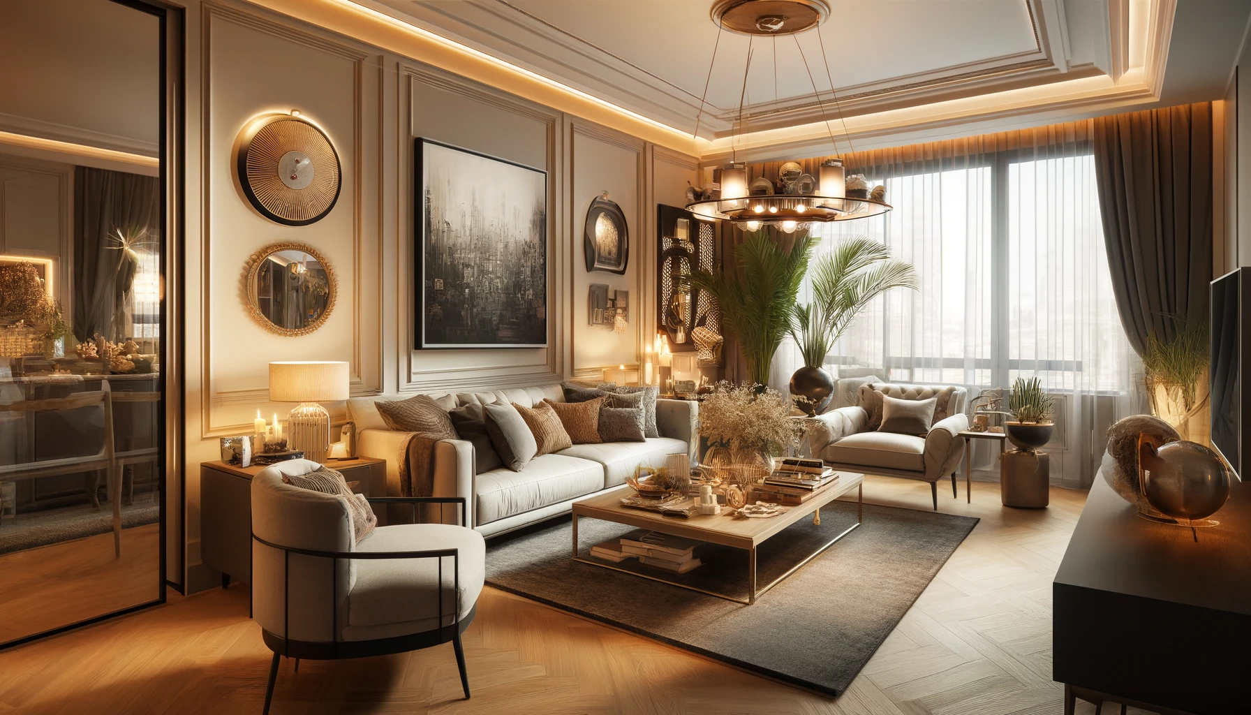
Wall colors and their effect on space
The effect of wall color on a feeling of emptiness or narrowness
Wall colors are one of the main factors that affect the impression of a space.
Choosing a light color gives the room a feeling of freshness and spaciousness,
while a dark color can make it appear narrower and warmer.
Choose the appropriate colors to expand the room or transform it into a warm place
When designing home decor, colors must be chosen carefully to achieve the desired look.
Using light colors such as white or pastels can create a feeling of expansion and freshness,
while dark colors such as navy blue or gray can transform the room into a warm and cozy space.
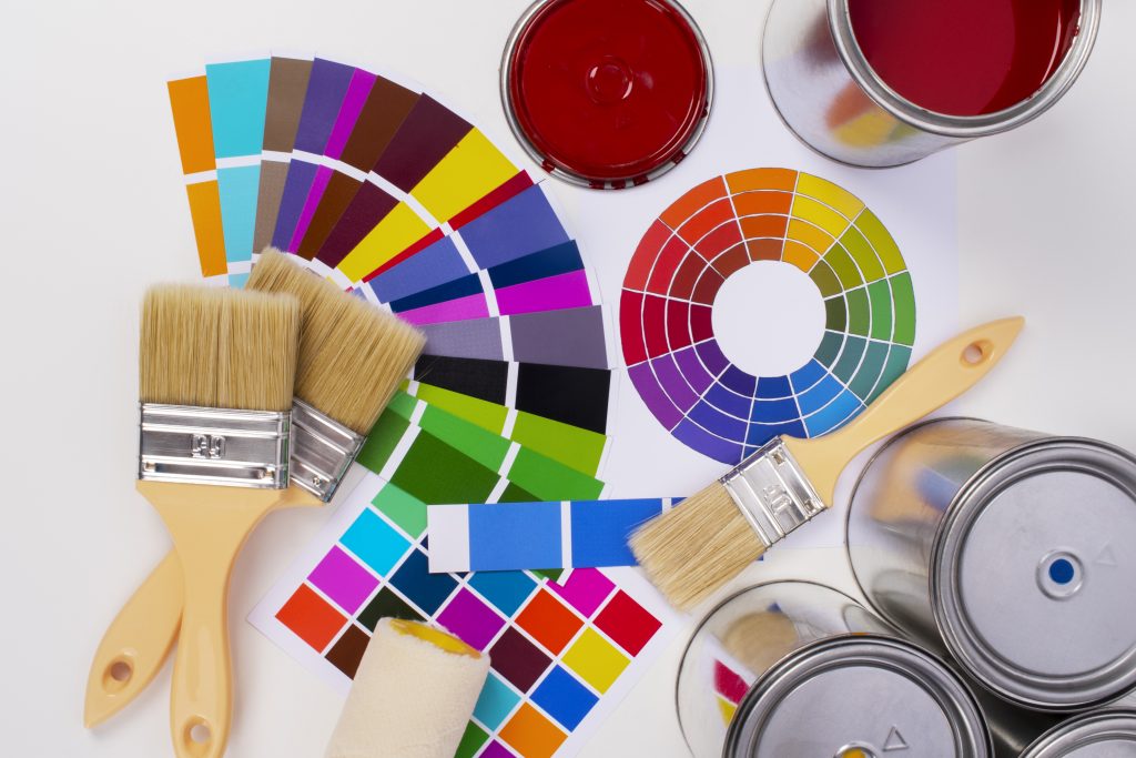
Guidelines for choosing main colors
Technical secrets for choosing basic colors in interior design
When choosing colors for walls, consider the impact of each color on the space. Light colors expand the room and reflect light, while dark colors give a feeling of warmth and security.
Ways to coordinate the main colors in a creative and attractive way
Light colors can be coordinated with dark ones to achieve a perfect balance. Using bright accents such as pillows or paintings can add an aesthetic dimension to the overall decor.
Use contrast between colors
The role of contrast in achieving balance and attractiveness between decorative elements
The element of contrast plays a vital role in achieving
a balance between interior décor elements, as contrasting colors can be used elaborately to attract attention positively.
Mix contrasting colors properly to attract attention
By choosing the right coordination of contrasting colors, the aesthetics
of the decor can be enhanced and make it look more attractive and lively in an eye-catching way.
Add bright and warm colors
How to incorporate bright, warm colors into home decor
Adding bright, warm colors to home decor can create a warm and lively atmosphere to the place.
This can be achieved by using colors such as red, orange, and yellow to add a touch of warmth and activity to living spaces and bedrooms.
The best ways to use warm colors to make a space welcoming and bright
A bright, welcoming atmosphere can be achieved in spaces by using warm colors such as light yellow and beige in furniture and accessories.
These colors contribute to making spaces appear larger and more refreshing to achieve a comfortable and cheerful environment inside the home.